Even though I am mixing different combinations of pigments and painting all the time, right in the middle of demonstrating to the artists in the group, I had one of those "aha" moments. A certain combination of red-violet and yellow was exactly what I needed for a commission I'm working on.
I have often suggested that you make a color chart of all of your pigments so that you know what "color" they really are, and how they look when diluted with a little water. Be sure to label them with the manufacturer and the pigment name.
Although the primary reason to do this is to know exactly what you have, it also shows you just how similar many pigments are, even with different names. I think I have eleven yellows that are almost identical.
This has worked
very well for me. I ruled out 3" squares on a full sheet of Arches cold
press paper, leaving a narrow border
between each square.
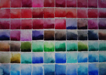
This was my
first chart. I made it when I started painting. It has all of the
pigments that I owned at the time, except the yellows, which were on
another sheet. Each one has the pigment name and the brand.
Some
of you have seen this photo. "Tea And Sushi" had been given the Daniel
Smith award in the Canadian Society of Painters in Watercolour's
International exhibition. The prize was one of every tube of watercolor
pigment that they make. I really wanted to have a good photo to
celebrate this bonanza of paint! So I dumped them all of the table, and
let them fall through my hands as if it was a pile of jewels!
My
next thought was "this is going to be so confusing that they will be
useless". You can't tell the color from the swatch on the tube, and this
collection of 297 tubes included duochrome, iridescent, "genuine",
metallic - plus all the others.
So,
for the next week, each morning, I spent an hour or so making charts. I
did all of the yellows, then the sienas (there must be 20 of them),
then on to the reds, violets, blues and greens. I made six sheets
altogether.

This is one of the "green" charts. The three bottom rows are pigment straight from the tubes, mixed with a little water.
On the top you can see two rows of neutral greens and the third row of all of the blacks in the collection, as well as indigo and sepia. For the second row, I mixed each black, indigo and sepia with aureolin yellow.
The first row on the top three is the same dark pigment with more aureolin yellow. These were not as satisfactory; they lost their glow.
It was very interesting to see how lunar black especially, resulted in a heavily granulated mixture.
We don't usually mix
black and yellow to make green in watercolor the way we do when using
oils, but I wanted to see what the result would be.
I use these charts constantly. They have saved me so much time when I'm planning the palette for a painting.
During the workshop, we mixed the grays, greens, darks and found the complements to each one. This is another very valuable refresher for all of us. It's so important to use our knowledge of color theory to enhance our paintings.
During the workshop, we mixed the grays, greens, darks and found the complements to each one. This is another very valuable refresher for all of us. It's so important to use our knowledge of color theory to enhance our paintings.
Happy Painting!
Evelyn
Evelyn Dunphy
596 Foster Point Road
West Bath, ME 04530