Sunday, October 11, 2015

Keeping Your Plein Air studies Open and Airy OR -

How to avoid "locking the painting in on all sides".

Sometimes when we are painting out of doors, we find ourselves facing a solid wall of trees leading into the part of the landscape that we are really interested in painting. What to do? Obviously, we want to keep the feeling of the place, which seems to require some degree of faithfulness to the reality. 

Here is an example that I think suggest ways to surmount the problem.The photo below shows the actual scene. Two medieval tenant farmers' houses nestled in a virtual forest of greenery.,


Looking at this scene, I am sure you can imagine that there was a real possibility of totally enclosing those ancient farm houses in dark green trees. 

Here is my solution:
 

I chose a vertical format for my painting, and included the top of the far mountains plus a bit of sky to help lighten the mood of the painting. The mountain ridge right in front of me was rather flat so I looked to my right and used the more interesting profile. It is important to create an interesting negative space of sky.

 I opted to leave the trunks and some foliage on the tree in the foreground white, by painting around the shapes, and then left soft-edged forms at the bottom of the page. 

The other major change from the reality was so put some of the warm tones of the roof tops into the forested hills above, as a unifying element.

And there is the question of “should we put in a blue sky” or not? There was a blue sky in this scene as well. I think it works much better with a peachy-colored sky.

This painting could be done with several color plans; but I feel that the challenge is using the real scene and creating a "painting" - rather than faithfully copying just what we see.

Wednesday, August 26, 2015

A Voice From the Australian Outback

When I invited comments on my last blog discussing Gale Bennett's opinions on "Spatial Tension", I hoped to hear some challenging thoughts, and perhaps a few images as well.
I've heard from several people, and one of the most interesting discussions have been with Meg Vivers, Australian historian, author and artist. This is one of those times when one feels an instant kinship with another person. I am hoping to meet Meg in person - perhaps even in Havana......


Examples of Meg's paintings can be found on her website: 
http://megvivers.com.  


Meg writes:


The paintings I have done of our outback country and desert seem to need lots of what perhaps could be termed negative space. In fact the space is what evokes the huge sense of distance and timelessness out in that country.
Evelyn:  Exactly.....the question could be "does the line that separates one part of the negative space from the other have "life."' Does it require a smooth, continuous line or would a broken line, a line with some irregularity add to the image? Perhaps not - but a good question.


Meg:  Does your Raphael portrait have that effect?  I wonder. 


Evelyn: I see the line that defines the hat, collar and shoulder as being very much "alive". And on the other side of that line, the negative shape is strong.

Try this exercise: draw the shape of the background just using the line. Then draw the line that defines the hat, collar and shoulder with no suggestion of interior shape or subject.

Turn your paper on its side. Does the line suggest "life", movement, interest - or is it static? 
  

Meg: This portraIt is, one would suggest, a very static painting (timeless?) Does negative space when it dominates or competes with positive space  present something timeless?


Evelyn:  I like the uncertainty of "static vs. timeless". Which is it? Bennett Gale suggests that the powerful line that defines the negative and positive space (of the figure and hat with background) creates a "locking" of the background shape with the positive shape - resulting in spatial focus". It's the LINE that makes the difference. Imagine the painting with a smooth, curved hat and shoulder. 

Meg: Is there tension in my outback paintings? Or is there a mysterious sense of deja vu as the seasons repeat. More importantly, does the negative space become the most important aspect? 

Evelyn: I find the sense of mystery to be most powerful in your work. The sense of space is especially vivid. 


Meg:

I obviously feel the need for strong lines, especially in my stronger paintings, to bring them to life. Never thought about them being a separation, rather than a way of defining shapes.

Evelyn:  It's more that the line creates a shape on EACH side, rather than thinking of it (the line) as a separation


Meg:  On the other hand, I now feel more and more the need to enter the negative space with softer lines and shapes, which introduce extra layers and evoke movement throughout the painting.
 

Rain On Fire

Are these paintings more representative of my immediate surroundings on the Eastern tablelands - bush, rocks, trees, etc.?   Perhaps.


  Below is another where negative space has been populated with more detail. Does this painting still have negative space?  Or is it just a series of layers?  


Mist Not Rain
Evelyn:  I see layers of color, interesting negative shapes within the larger shape.. and great lines.


I am convinced that the value of studying ideas like those espoused by Bennett Gale is in provoking conversations like the one we are having here.I think the value is in the questions and then how the artist responds to them.  
   

Meg: 
For some reason, recently my hand can't help moving into the spaces, using lines that later become vaguely familiar shapes.

Of course, once you start this, the sky has to move as well! Not only does the  sky have to become more fluid, the trees must penetrate the horizon and break into the sky.

Am I eliminating neg space because I have not been out into the centre of Australia for some time, and I have forgotten the space
which impacts on you, especially at night?? Out there in the desert,  the space is the reality.  You have to look closely for the detail! It is there, but you do not notice it at first. 
 
Another artists' thoughts on the next posting; join in the conversation!
Leave a comment or send me a note at artist@evelyndunphy.com with your thoughts.

Happy Painting!
Evelyn
 

Tuesday, August 18, 2015

Tension: Is It Good for Your Painting?

As you know, next to actually painting, I love studying about painting, color, design, methods - anything and everything about our favorite subject!

Last night I came across a comment that I want to share with you.  It's by Gale Bennett (GALE BENNETT (1939-2008),Founder and Director of ArtStudy Giverny in Giverny, France).


"If we want to isolate the one single element that makes a painting a masterpiece, it is spatial tension."


Raphael: Portrait of "Count Baldassare Castiglione, C. 1514"


What is "spatial tension?"

When I looked at this portrait, I saw what I would describe as a really great "negative space" that separated the hat from the background.
As Bennette described it, this portrait is a perfect example of one of the "formal" elements of masterful art" which is spatial tension.  

Bennett says Raphael arranged the subject's hat and collar to create one of "most memorable background shapes in the history of art". Wow!

In my workshops and classes, I talk about "intersecting shapes, linking shapes, over-lapping shapes in order to make an exciting design.

And in my landscape paintings, I always concentrate on the "negative shape between horizon line, tree line and/or sky" as that can be fairly uninteresting in real life and one must create variation in shape, size and height in order to eliminate tedium.

I was so happy to realize that what Bennett is saying so eloquently, means that I am on the right track. This is how he put it:

"The visual locking of the background into the subject matter creates extreme spatial tension, ia also known as spatial focus.  When combined with the universal elements of form, composition, color, value and size, it helps answer the question: what makes a masterpiece."


Black Beauties

Right now, I'm saying loud and clear that I am NOT comparing my eggplant painting to Raphael's portrait!!

But - I do think this composition contains very interesting negative shapes.

Can  you think of any painting that you have seen that meets this level of "memorable background shape?"

Let's do some research!

Please send me a painting that you think is a good example. It could be one of yours!

I'll post them in my next blog.

Here is another site that has some good information on how spatial and visual tension can affect your painting.

http://vanseodesign.com/web-design/visual-tension

Leave a comment or send me a note at artist@evelyndunphy.com with your results.

Happy Painting!
Evelyn

Sunday, June 28, 2015

PB & J? Really?

It's a rainy Sunday morning here in Maine and I'm thinking about a very cheerful subject to write about. In my weekly classes, I often set up a still life arrangement. Believe me, I really search for objects that I know will get artists excited! We've had mackerel, high-heeled black sandals with accessories, high tech tools, all-white subjects .....too many to name.

Food has always been a great source of inspiration for artists. I knew that sooner or later, a butter and jelly sandwich would be a great subject. My set up was not one I would want to eat, as the hearty grain bread was cut really thick and the peanut butter and jelly were really ladled on - especially so that they would ooze out of the sides. 

Here are a few things that we learned from this subject:
- everyone had good results with creating the texture of the bread. No two were alike, but overall, getting the value and warm temperature of the sides of the bread in the light and the crust was the key.  

- it was surprisingly difficult to get the color of the jam to look as if you would want to eat it! I deliberately chose the darkest violet-red jam, knowing it's very easy to mix vibrant violets with alizarin crimson and thalo blue red-shade. But these mixtures just didn't look tasty at all! The best results came with adding bits of ultramarine blue - cutting down a little on the brilliance.

- it seemed obvious that yellow ochre would be a good color for peanut butter. But again, it was not quite that simple. It took some experimenting with the ochre, sienna, and touches of darker brown to pull it off. 

Patti's painting turned out really well. Here it is; the photo has the glass of milk a bit "off" - just ignore that.  Doesn't it look as if you could just take a big bite out of it!


Just think of the famous still life paintings of food - I just made a strawberry-rhubarb pie and it could be a perfect subject for a painting!  So off I go; hope you are having a great day, and I'd love to see a photo of your next painting. Leave me a comment and I'll get back to you right away.

Tuesday, May 12, 2015

How Many Shades of Yellow?

I've just finished teaching a four day "Introduction to Watercolor" and once again, I am reminded of how really important it is to re-visit the basics.

Even though I am mixing different combinations of pigments and painting all the time, right in the middle of demonstrating to the artists in the group, I had one of those "aha" moments. A certain combination of red-violet and yellow was exactly what I needed for a commission I'm working on.

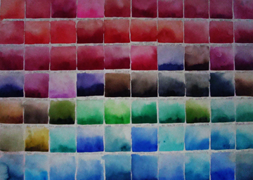
I have often suggested that you make a color chart of all of your pigments so that you know what "color" they really are, and how they look when diluted with a little water. Be sure to label them with the manufacturer and the pigment name.

Although the primary reason to do this is to know exactly what you have, it also shows you just how similar many pigments are, even with different names. I think I have eleven yellows that are almost identical.


This has worked very well for me. I ruled out 3" squares on a full sheet of Arches cold press paper, leaving a narrow border
 between each square.
This was my first chart. I made it when I started painting. It has all of the pigments that I owned at the time, except the yellows, which were on another sheet.  Each one has the pigment name and the brand. 
Some of you have seen this photo. "Tea And Sushi" had been given the Daniel Smith award in the Canadian Society of Painters in Watercolour's International exhibition. The prize was one of every tube of watercolor pigment that they make. I really wanted to have a good photo to celebrate this bonanza of paint! So I dumped them all of the table, and let them fall through my hands as if it was a pile of jewels!
My next thought was  "this is going to be so confusing that they will be useless". You can't tell the color from the swatch on the tube, and this collection of 297 tubes included duochrome, iridescent, "genuine", metallic - plus all the others.
So, for the next week, each morning, I spent an hour or so making charts. I did all of the yellows, then the sienas (there must be 20 of them), then on to the reds, violets, blues and greens. I made six sheets altogether.


This is one of the "green" charts. The three bottom rows are pigment straight from the tubes, mixed with a little water.

On the top you can see two rows of neutral greens and the third row of all of the blacks in the collection, as well as indigo and sepia. For the second row, I mixed each black, indigo and sepia with aureolin yellow.

The first row on the top three is the same dark pigment with more aureolin yellow. These were not as satisfactory; they lost their glow.
It was very interesting to see how lunar black especially, resulted in a heavily granulated mixture.
We don't usually mix black and yellow to make green in watercolor the way we do when using oils, but I wanted to see what the result would be.


I use these charts constantly. They have saved me so much time when I'm planning the palette for a painting.

During the workshop, we mixed the grays, greens, darks and found the complements to each one. This is another very valuable refresher for all of us. It's so important to use our knowledge of color theory to enhance our paintings.

Thank you for reading my blog, and if you have comments or questions, please do leave a comment or send me a note at artist@evelyndunphy.com and I'll respond right away.

Happy Painting!
Evelyn

Evelyn Dunphy
596 Foster Point Road
West Bath, ME 04530

Sunday, April 19, 2015

Can I Fix This?

How many times have we heard  watercolor described as being "the hardest medium to use"....."you only have one chance" and so on. I'm the first one to say that there are times when you've lost the glow, the transparency is gone, the colors are "muddy" - and it's a lost cause.  BUT - my experience is that there really is a lot that you can do to resolve problems, and rescue a painting. 

Here's an example that happened to me this week. In my illustrations for the book 'I Am Coyote", one of the paintings shows a young coyote leaving her parents to move out on her own. She has moved away from them, across a stream and is looking back at them. 

Since the painting is 22 x 30" and it is going to be greatly reduced for the book, I felt I couldn't make her too small, as she would become too indistinct. Here is the result of that decision:

You can see that her head as well as the body where it joins the head are both too large - what to do? There was only one solution. Lift out the head and some of the body and repaint. Scary? YES!! I have many hours invested in this painting already. But, no choice.


After I let the paper dry completely, I redrew the head and chest and began again. Here's the result:


Now she is back far enough that she is in the correct proportion to the foreground and yet still visible when reduced to the size of the page. This was an interesting problem to solve, as I was dealing with not only the perspective sizes of the three coyotes, but the need to keep her a bit larger than I would otherwise would have done. 

My real point in this post is that when something isn't right, there's only one choice, and that is take whatever risks are necessary in order to make it right. And you would never know that I lifted all of that pigment and re-painted. This painting is on 300# Arches hot press paper. I have found it to be very forgiving and the love the texture I can create on it. If you haven't tried it, you may find that you enjoy it as well. I choose my paper that I think will be best for my subject matter.

Wednesday, April 8, 2015

Reality Vs. Mysticism

Recently I was asked to paint illustrations and the cover for a book titled "I Am Coyote, Who Are You?". At first, the suggestion was that I create an image where coyote is not quite hidden behind snow-covered branches, with lots of blues and siennas in her face. Here's what I cam up with:


The letters were just laid on the painting to see if there was enough room for them!

When I finished the painting, I knew that it was not what the author wanted. I called her and she came right over. Sure enough. She said that she wanted a "mystical, golden creature". Very different from my first assignment!

I had ten minutes of anxiety. How does one paint a "golden, mythical creature"?
Then I just went to work, and here is the result:


The author loved it.

I thought I would write to you about this, because it shows two very different approaches to the same subject. Just imagine what could happen with a still life, or a landscape if one took two such different ways of portraying the subject?

I'd love to hear your thoughts about how you plan the mood and message of your paintings. Just write a comment below and I'll respond right away.

Happy Painting!

Tuesday, March 3, 2015

Cats and Hats

I've been having a lot of fun making paintings to illustrate a children's poem; on number seventeen today and I think I'm done. It has given me so many reasons to try out the iridescent and duochrome pigments that I received from Daniel Smith for the award. As a landscape painter, I don't have many uses for them, but in the "magical" images for the poem, it was a perfect time to try them. I'll attach one painting - I'm

not sure if the computer screen will show the sparkly effect. I added sapphire blue for shadows on the lion's golden coat. Funny, the photo makes the book shelf look as if it's falling! Must fix that.

Hope you are having some good painting hours during this snowy winter. I'll be back soon.

Friday, January 23, 2015

Painting Luminous, Transparent Reflections


"How do I paint this reflection" is a question that comes up frequently. So while the snow flies outside, I've made a cup of tea and have a chocolate chip cookie that our family packed for us before we left Wilmington, NC  (where it was 70' yesterday), so let's see what happens!


Cloud Patterns on the Lake     


A reflection is literally a mirror image. The shapes being reflected are in reverse. The reflected objects on water are always darker OR lighter than the objects they are reflecting. 

     A good rule of thumb is that lighter objects will reflect darker, and darker objects will reflect lighter. However, be aware that the darkest reflection cannot be as dark as the darkest reality. Direct observation in nature will illustrate this. It is difficult to tell from a photograph.


This is how I painted these reflected clouds:

- I completed the "reality" from the sky to the shoreline.
-  then I lightly sketched in the cloud shapes. I don't want the pencil line to show so I keep it very light.
-  I mixed up several colors that I expected to use in the reflections. It's very important to have the same amount of pigment and water in each mixture so that you can control the edges of each shape as you paint them
-    beginning at the left hand side by the shore, I took my time and painted each shape, wet paint on dry paper, moving from one shape, color and value to another.
-   Because I am painting one shape next to another, the edges merge softly and look like water. If I see that an edge is beginning to dry before I can paint the adjacent shape, I soften that drying edge with a damp brush so that I can come back to it and continue with a soft edge.

BE CAREFUL NOT TO HAVE EXTRA WATER ON YOUR BRUSH when you do this as it will run into the adjacent shape and create "blooms". 
 It isn't necessary to paint fast; BUT you must watch the edges of each shape and keep it damp so that you can paint up to it.

Water also distorts the reflection if there is any movement. Ripples and waves will distort the shape of the reflected object. Rippled water is like looking at series of tilted mirrors.

I think you can see in this painting that although the water is only slightly disturbed, that the edges of the reflected clouds are "broken" or irregular. 

Detail of plein air watercolor
In this example, you can see that the color of the sand under the water affects the colors that are seen in the reflection.
 
This is a painting of mud flats at low tide with the sky and clouds reflected on the wet mud. 
 
 These reflections were painted using the same technique as the cloud reflections.  

Additionally, when the reflections were dry, I added a few sunlit spots with white gouache. This helps add "sparkle" to the water - almost like little bubbles. 
You can also add these sparkles with masking fluid before beginning. Paint the tiny shapes carefully, and also spatter tiny sparkles with a toothbrush. 
 
This is another example of how the underlying colors of the wet mud affect the colors of the reflections. Although these reflections are seen on the sea bed rather than on clear water, I use the same method to paint them.

The main difference is that I also added wet in wet marks on the damp pigment to create the look of seaweed, stones, and the myriad textures of the wet seabed.

Evening Sky Reflected on the Bay 
22 x 30"
Private Collection 

If you turn this painting upside down, it reads perfectly well with a low horizon line and the painting becomes all about the sky rather than the bay.

When painting wet shapes one after another in a large size it's necessary to plan how you are going to tackle it.
For this painting, I made sure that I mixed up all of the colors that I wanted to include in the watery reflection.  
Then, using a large brush (always use the biggest one you can use for the shape you are painting), I began at the horizon line, and painting wet pigment on dry paper, I loaded my brush with a lot of pigment and water and painted each area one after another until I reached the bottom of the painting.

Where I wanted to increase the value of a shape, I "charged" more pigment mixture into it before it began to dry. Once these shapes begin to dry, it's best not to try to go back into them to make changes. Wait until it's totally dry, and then re-paint, using a very light hand, and keeping the edges softly merged. 


I hope this inspires you to try some reflections. I suggest that you try four quarter sheets with different compositions, and practice. In a nutshell:
- mix your colors with the same amount of pigment and water.
- after you clean your brush, lay it on a sponge or towel to take   out the excess water so that you don't alter the proportions of pigment and water in your mixtures.
- mix more pigment mixtures than you think you need.
- don't go back into damp washes; if you must make a change in that shape, wait until it's dry, re-wet and paint again.

Have fun and let me know how it goes!


Saturday, January 3, 2015

Expecting the Polar Vortex? I Have another Idea!

Today is the lull before the storm! We are promised another January Polar Vortex and you won't be surprised to read that this took my imagination straight to the sunny Costa Brava of Spain.
So, instead of this:


 I am anticipating this!


Please visit the Frenchescape website to read all of the details and sign up to join our group.  
www.frenchescape.com

I promise you that you have a great time and go home with a new excitement and skill level in your painting.

 Here's a recommendation from a very accomplished artist who attended my workshop in Ireland last year:

Our time together painting in Ireland has influenced how I paint in a rather profound way. I knew it then, after the Retreat, but you never know how it will hold up. I can now confidently say, 3 months later, it has a lasting impact. You are an extraordinary teacher in the ways you are able to divine where each student is in their process, and adapt what you know to share productively and successfully with them. I am a drawing teacher; I know a good teacher when I meet one, and you are one. Thank you!
Susan McC. North Carolina  
 

You might ask why I chose the Costa Brava for my September 2015 workshop when I was also offered Italy, France, Switzerland, Holland and Belgium. They were all beautiful and another time I'd love to go there. But when I saw the photos of the medieval villages of Calella de Palafrugell and Pals, the decision was made.
We will be painting in these medieval villages, at gorgeous views on the beach, gardens, and at a hidden gem amongst all other villages along the Northern Costa Brava. The village of Calella de Palafrugell is made up of endless rocks, cliffs and extremely beautiful beaches.
 

On another day we will paint in Pals, an unique Preserved Medieval Village  
As you walk through the narrow village streets, next to the city walls, towers and churches, you will feel as though you have walked into a new time altogether.
The stone archways, cobblestone streets and wrought balconies adorned with flowers create a welcoming feel in this Romanesque village.

 We will be transported to our painting site each day by Jackie Grandchamps who has become known for her small group individualized workshops.


and scroll down to September 2015 to learn about my workshop.
To register for the workshop, send an email to Jackie Grandchamps at 
contact@frenchescape.com;
 

And then there's the 
 Jardi Botanic de Cap Roig. It is considered one of the most important botanical gardens in the Mediterranean.


For those who are interested we will go to see the largest surrealistic object in the world created by Dali, the Dalí Theatre-Museu in the town of Figueres, his birthplace.
Visit the website: Frenchescape to read the complete brochure. Just click on Painting Tours, then Barcelona/Spain and scroll down to September 23 - 30th for my workshop.
We will have a tour leader throughout and when we say throughout, we really mean it. From breakfast till dinner, our guide will be with us at all time. She will eat with us, translate for us, drive us, take care of us and make our stay a one-of-a-kind experience.
  
On our art workshops, the tour leader will bring us lunch so we don't have to stop painting, she will drive us to the painting locations and she will accompany us to shops and museums when we are done painting.
  
Because of the small group environment, we will be driven in a air conditioned 9 seater van, not in a huge monster motor coach. The guide/driver will stop anytime for pictures or any other stop needs we request.
  
We'll will be driven to the painting sites, so no need to carry your painting supplies on long walks.
  

To register for the workshop, send an email to Jackie Grandchamps


So, back to
enjoying winter in Maine whilst anticipating the pleasures of Spain next September. I'll be hoping to see you!

My very best wishes for a grand New Year. May you be well and enjoy all of the blessings of life.
Evelyn

Evelyn Dunphy Studio
596 Foster Point Road
West Bath, ME 04530
207-443-5045
www.evelyndunphy.com
artist@evelyndunphy.com
 

Friday, January 2, 2015

Painting a Starry Sky

As I prepared to respond to the emails that I've received from artists who asked how I painted the sky in the painting "Wild Song," I thought that it may be of interest to you as well, so I have turned it into our first lesson of 2015 - can you believe it!

Here is the painting:


Materials used:
  • a full sheet (22 x 30") 300# Arches cold press paper.
  • Daniel Smith paints: Permanent Rose, Quinacridone Magenta, Permanent Alizarin Crimson, Phthalo Green, Ultramarine Blue, Phthalo Blue Red Shade
  • Masking Fluid
  • Toothbrush and different size brushes for spattering masking fluid. 
I wanted to create a very dark sky that had multiple levels of color and the illusion of the Milky Way. At a distance it would look almost black, but as you look closer you can see the variations of warm and cool dark values.

NOTE:   Before using any Masking fluid, remember to have a dish of diluted dishwater detergent or a small bar of soap available so that you can dip or rub your toothbrush or brush into it before dipping into the masking fluid. As you work with the masking fluid, your brush may get clogged; be sure to rinse it well and then dip again and continue masking or spattering. When you are finished, clean the brush thoroughly in soapy water. I keep some brushes just for using with masking fluid. It's a good idea to practice on a piece of paper before spattering on your painting as there is a lot of variety in how the spatter will look, depending on how the size of the brush, and whether you have water on your brush along with the masking fluid, as well as how high you hold the brush over the paper.
  
I want to be clear about the process of masking, painting and removing masking for this kind of effect. You could remove the masking after each new color, OR you could continue to mask and paint in layers, not removing the masking until the very end. It all depends on what you want to achieve. There is only one way to find out, and that is to do it! If you were to do this, I think you would want to remove the masking after three or four layers of masking and paint. Then you could continue if you wanted to add more paint. 

STEP 1
  • I masked out the coyote shapes and then spattered Masking Fluid on the dry paper. First I used a toothbrush in order to get many very small spatters. Then I put the masking on a brush and spattered larger droplets of masking fluid.
  • Dry the masking completely. I don't use a hair dryer, just let it dry naturally.
     
    STEP 2
      
    Next, I dampened some areas of the paper and dropped in dark valued mixtures of Permanent Rose and then Quinacridone Magenta, as in this photo. Soften the edges so there are no hard lines and leave the paint to dry completely.  

    • Next, I spattered Masking Fluid again. First I used a toothbrush in order to get many very small spatters. Then I put the masking on a brush and spattered larger droplets of masking fluid.
    • I removed the masking.

    • Dry the masking completely.
    • STEP 3
      • Again, dampen some other areas of the paper next to the rose and magenta, overlapping the edges slightly and drop in darker values of the rose and magenta. Add alizarin crimson to add another variety of dark red. Try to keep some of each color "pure" so that they do not just all mix together at this stage. Also keep the values dark so that you don't have to add more layers than necessary.

      STEP 4
      • Dry completely, remove the masking, and spatter again. Be sure to change "tools" to get different size spatters, otherwise it can start to look monotonous.
       
      STEP 5  
    • Continue to repeat these steps using the ultramarine blue and phthalo blue and phthalo green. Remove the spatter after each new color has been added and dried, mask again and then apply more color until you are happy with it.
    • When you are satisfied with the value and colors of the sky, let it dry completely and then remove the masking fluid
    • Here you can see the levels of color under the stars. I did not completely cover the different colors as I applied new layers. 
      STEP 6
    • If you think it is not dark enough, mix a "black" with phthalo green, alizarin crimson and phthalo blue, and add to the sky. You may not need to cover the entire area. If you are adding this dark mixture to some areas, be sure to soften the edges with a damp (not wet) brush so that there are no hard lines.
    STEP 7 

    I wanted to include the moon, but did not want it to be a cleanly cut out shape on the starry sky, so I cut out a stencil of a circle and as the painting and spattering of the sky progressed, I lifted out the moon shape from dry paper with a damp brush.  
       
    As I added additional paint to the sky, I continued to lift small sections of the moon, leaving some residual color as well as adding color where I wanted a deeper value. I liked the way the moon floated in the sky, seeming to be part of it.

    • STEP 7

      I spent time looking at the patterns of stars to see where I thought some lights should be made darker, or new color should be added to some of those light shapes. I used accents of cerulean blue and cobalt blue teal as well as rose to complete the stars.

      To re-cap, the process is:
    • Spatter masking fluid and let it dry.
    • Add paint and dry.
    • Remove masking fluid.
    • Add a new color and let it dry.
    • Remove masking.
    • Spatter masking again and let it dry.
    • Repeat as many times as needed to get value and pattern of spattering that you want.
    • Adjust color and value of stars as needed to complete the effect.
    • If you want to include a moon, see the comments in step 6.
    •  
    Have fun! And see you again very soon.
    Wishing you a New Year filled with blessings.