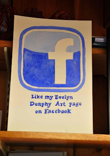
Is it art? Hunh, hard to say. The deep blue on the bottom with the light blue on top suggests a horizon, but a horizon shouldn't be curved, should it? But if it's art, should we even ask anything about "should" or "shouldn't"?
While it is based on the facebook icon, it's not the same--the icon has just one shade of blue behind the "f". The two shades, and the curve where they meet, give it more life than the corporate icon. The curve goes up at each end, giving it a hint of optimism.
The shape of the icon is very nicely made, a perfect rounded rectangle with a nice even border. Seems to be done freehand, by someone who knew what she was doing. And the letter "f" is made well too. The message at the bottom is a little irregular, the spaces between the words are not equal, and the alignment is a bit wobbly, so the words seem to be dancing, not just sitting on the page. It looks homemade--perhaps intentionally?
It's attractive, it raises questions. Maybe this viewer has read too much into it, but isn't that always a risk with art?
Reading too much into it" - That's the risk with art,and also can be a gift from the viewer to the artist. Whenever I look at that little sign in my studio and think I really should paint a more exact and true copy of the facebook icon, I say NO - I have grown to like those bouncy little words at the bottom. Thank you, Neil. I'm glad you see it, too.
Is it art? Hunh, hard to say. The deep blue on the bottom with the light blue on top suggests a horizon, but a horizon shouldn't be curved, should it? But if it's art, should we even ask anything about "should" or "shouldn't"?
ReplyDeleteWhile it is based on the facebook icon, it's not the same--the icon has just one shade of blue behind the "f". The two shades, and the curve where they meet, give it more life than the corporate icon. The curve goes up at each end, giving it a hint of optimism.
The shape of the icon is very nicely made, a perfect rounded rectangle with a nice even border. Seems to be done freehand, by someone who knew what she was doing. And the letter "f" is made well too. The message at the bottom is a little irregular, the spaces between the words are not equal, and the alignment is a bit wobbly, so the words seem to be dancing, not just sitting on the page. It looks homemade--perhaps intentionally?
It's attractive, it raises questions. Maybe this viewer has read too much into it, but isn't that always a risk with art?
Reading too much into it" - That's the risk with art,and also can be a gift from the viewer to the artist. Whenever I look at that little sign in my studio and think I really should paint a more exact and true copy of the facebook icon, I say NO - I have grown to like those bouncy little words at the bottom. Thank you, Neil. I'm glad you see it, too.
Delete